Symptom Checking Experience
Project Team: John Boyle, Michael Owen, Ben Sauer
My Role: Information Architecture > UX/UI Design > User Research
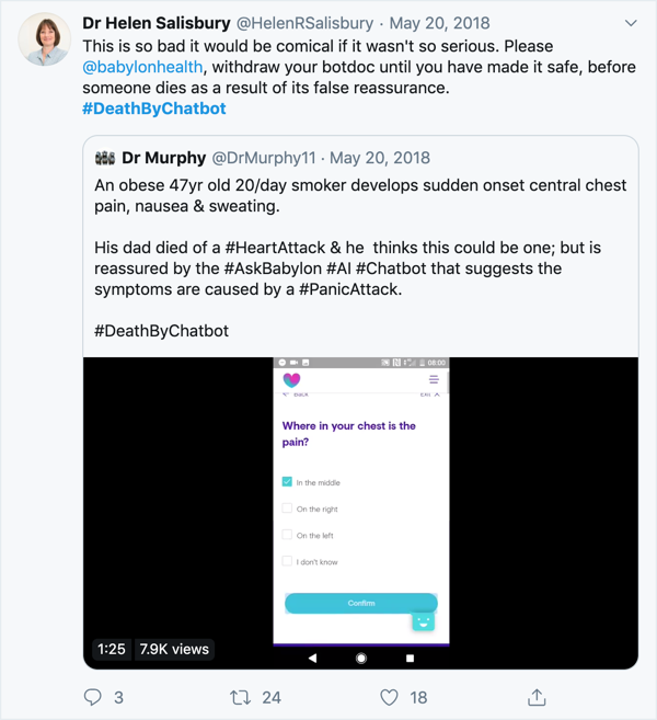
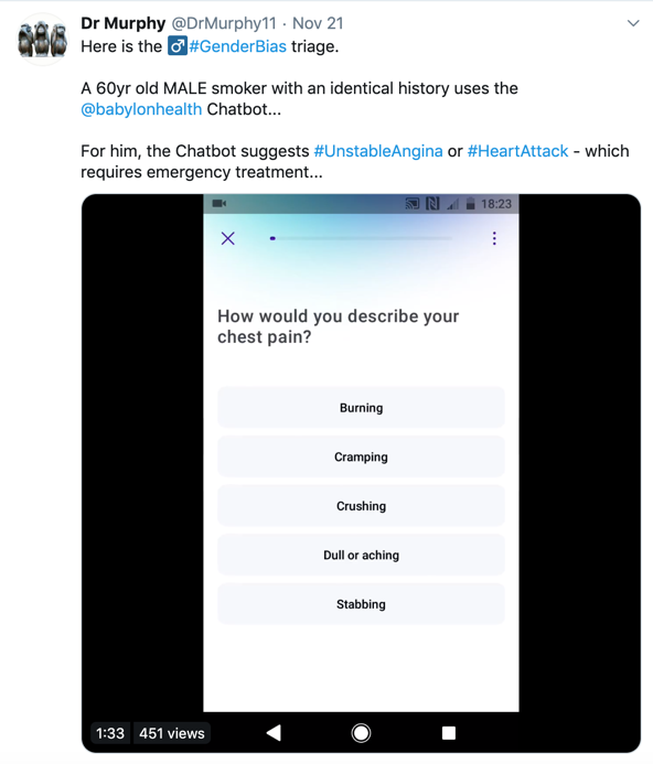
Positioning itself as a forward-thinking company, Babylon health had previously developed a number of cutting edge AI solutions. One, in particular, was their symptom checking tool – a tool which uses AI to mimic a doctor/patient question flow. As the company was striking more investment deals and growing in popularity, it became apparent that the solution itself was falling short in some areas. In this case, poor product = poor medical advice which could lead to be very dangerous. The PR noise was increasing and as such Babylon decided to form a squad to address these issues.
Given the nature of these issues it was deemed important to take two streams of work. Firstly, take a more tactical approach to fix key areas and stabilise the product. In tandem, various discovery streams were kicked off to gain a more holistic view of how the product could be better fit to the market. (You can see my contributions towards discovery streams here)
Goal
Refine the symptom checking experience to reduce significant errors and to reduce PR noise.
Initial Planning
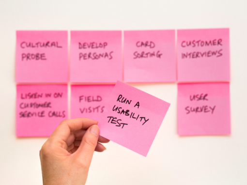
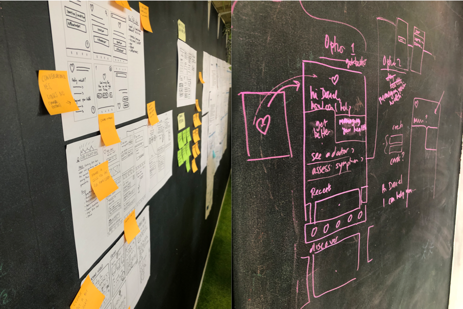
Initially I sat with other designers & stakeholders and spent time trying to further understand the problem space and constraints. From here we were able to gain an early picture of what success looks like. (resources c/o: Ben Holliday)
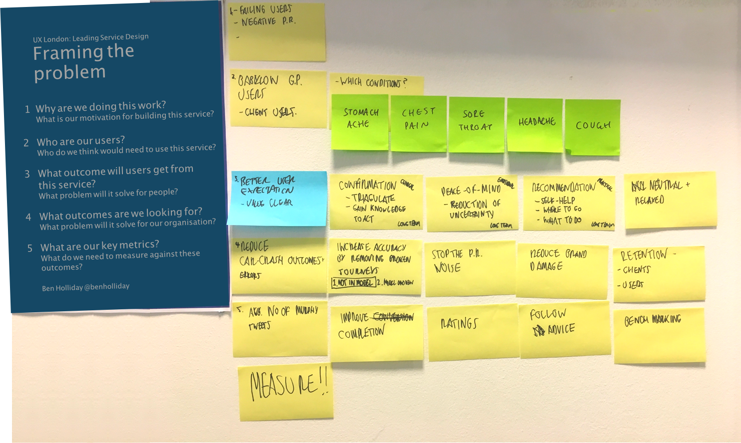
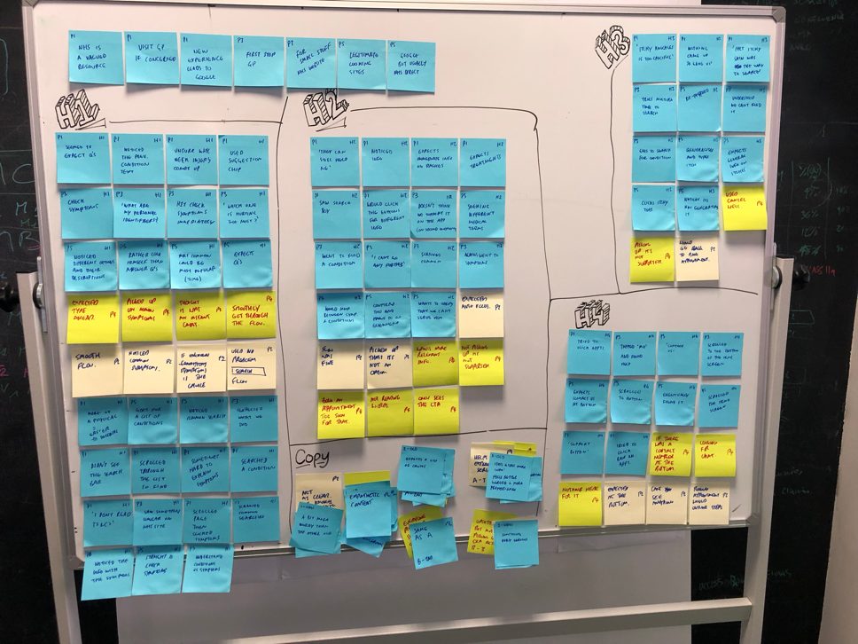
Audit
We held a group session in which we carried out an audit of the entire flow as it existed. It quickly became clear that there were 2 broad areas that we felt were problematic.
1. The upfront parts of the journey lacked the guidance and signposting which users needed.
People were seeing the existing ‘search bar’ as “google” – coming to us with every problem. Whilst this offered optimum flexibility, it gave little signposting as to what the product could/couldn’t do.
Consequentially, upon ‘not understanding’ someone, we weren’t entirely clear as to why.
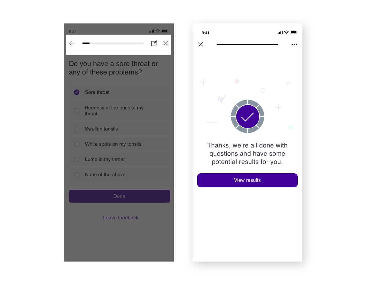
2. Multitude of ‘architectural and UI basics’ that needed to be done to streamline the flow.
- The ending of the flow encouraged users to skip results
- Overall navigation was lacking
- Various UI basics had been missed
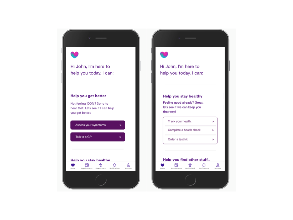
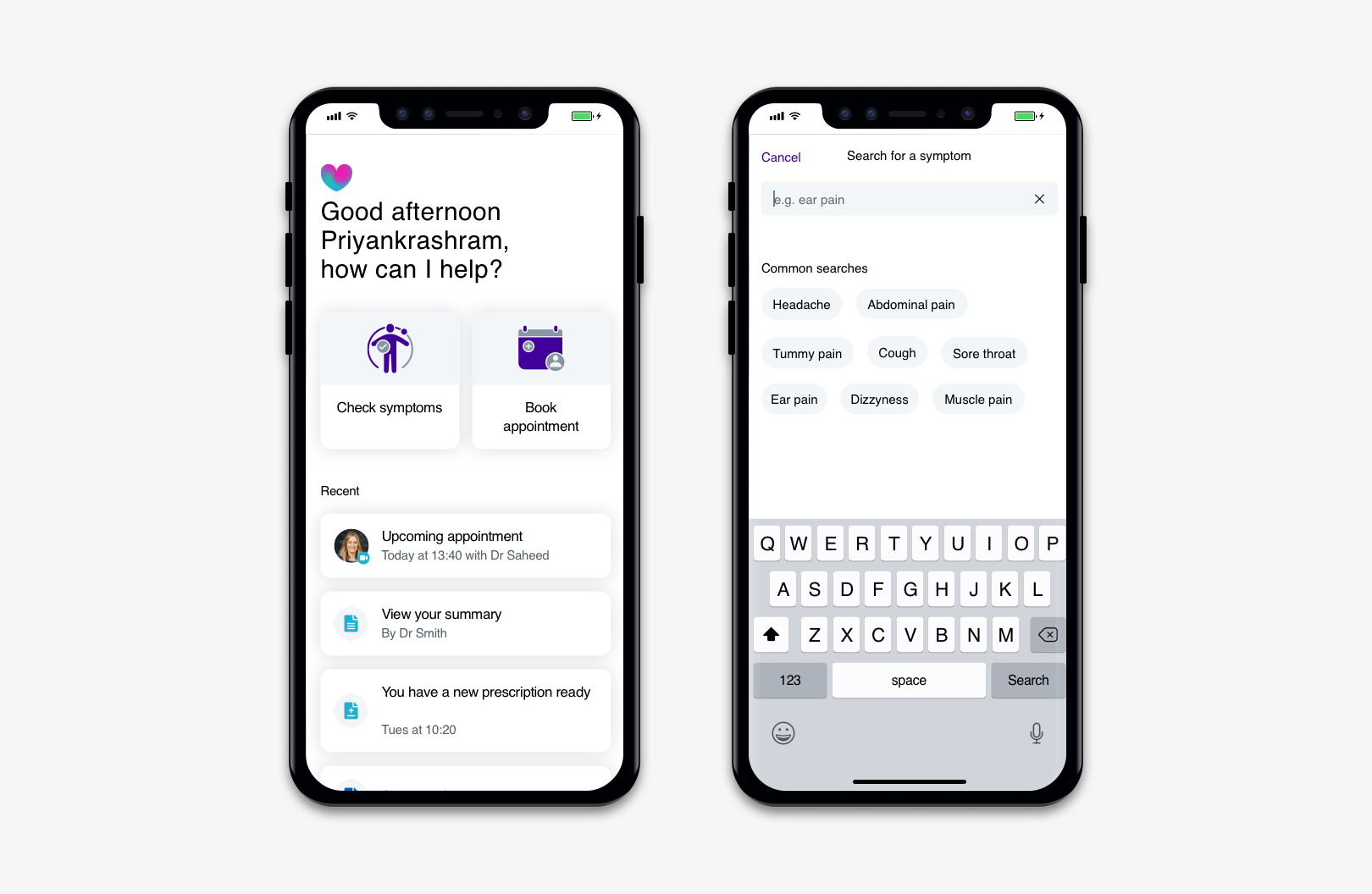
Primary focus
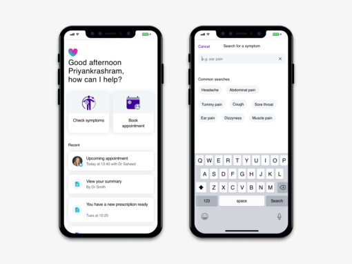
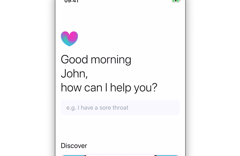
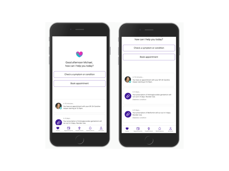
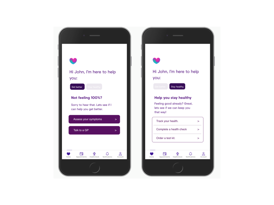
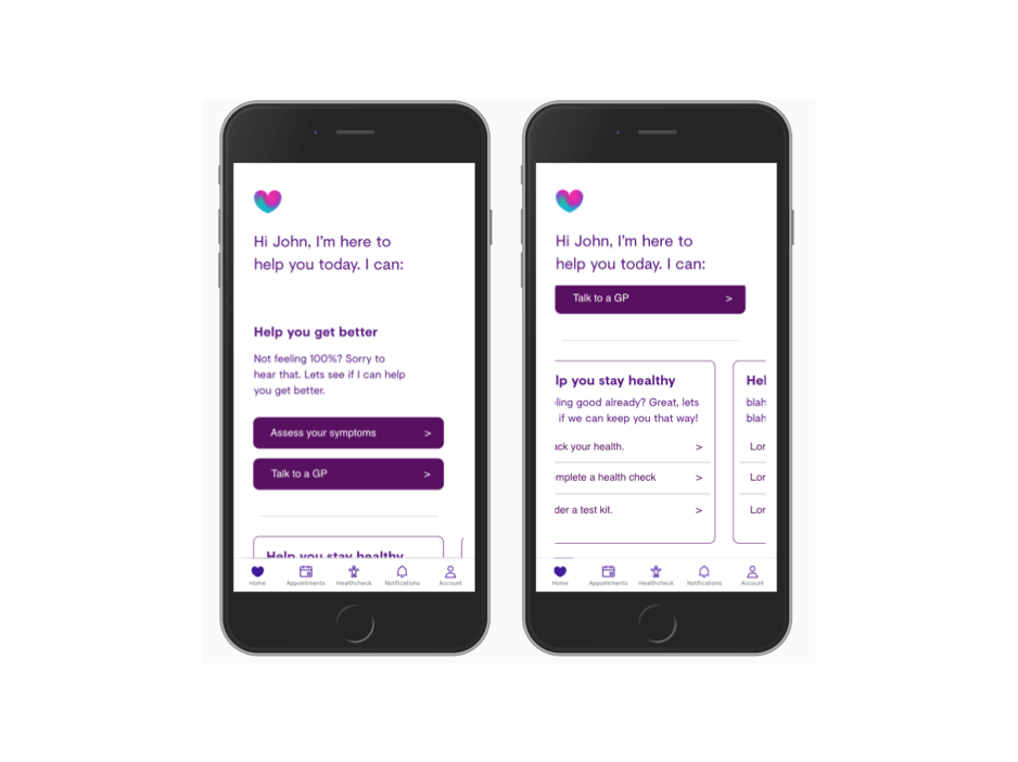
Based on timings, we decided to focus efforts on the Home Screen + Welcome flow – with particular areas of focus. We realised this would be where we got the most bang for our buck. However firstly we defined “what success looks like”
- Clear Value Proposition
- Clear Signposting
- Fail Gracefully
- Manage user expectations
- Under promise, over deliver
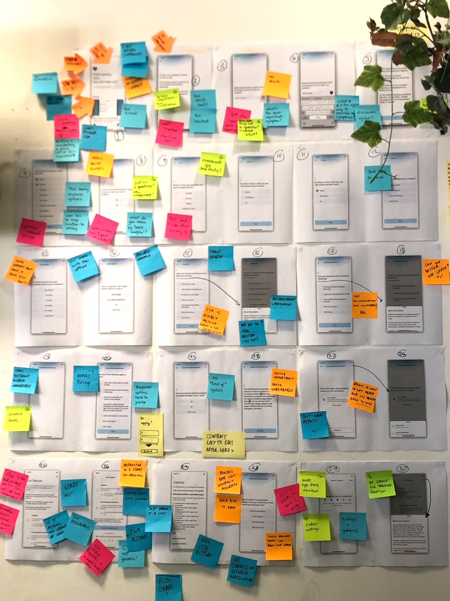
Ideation group work + Critiques
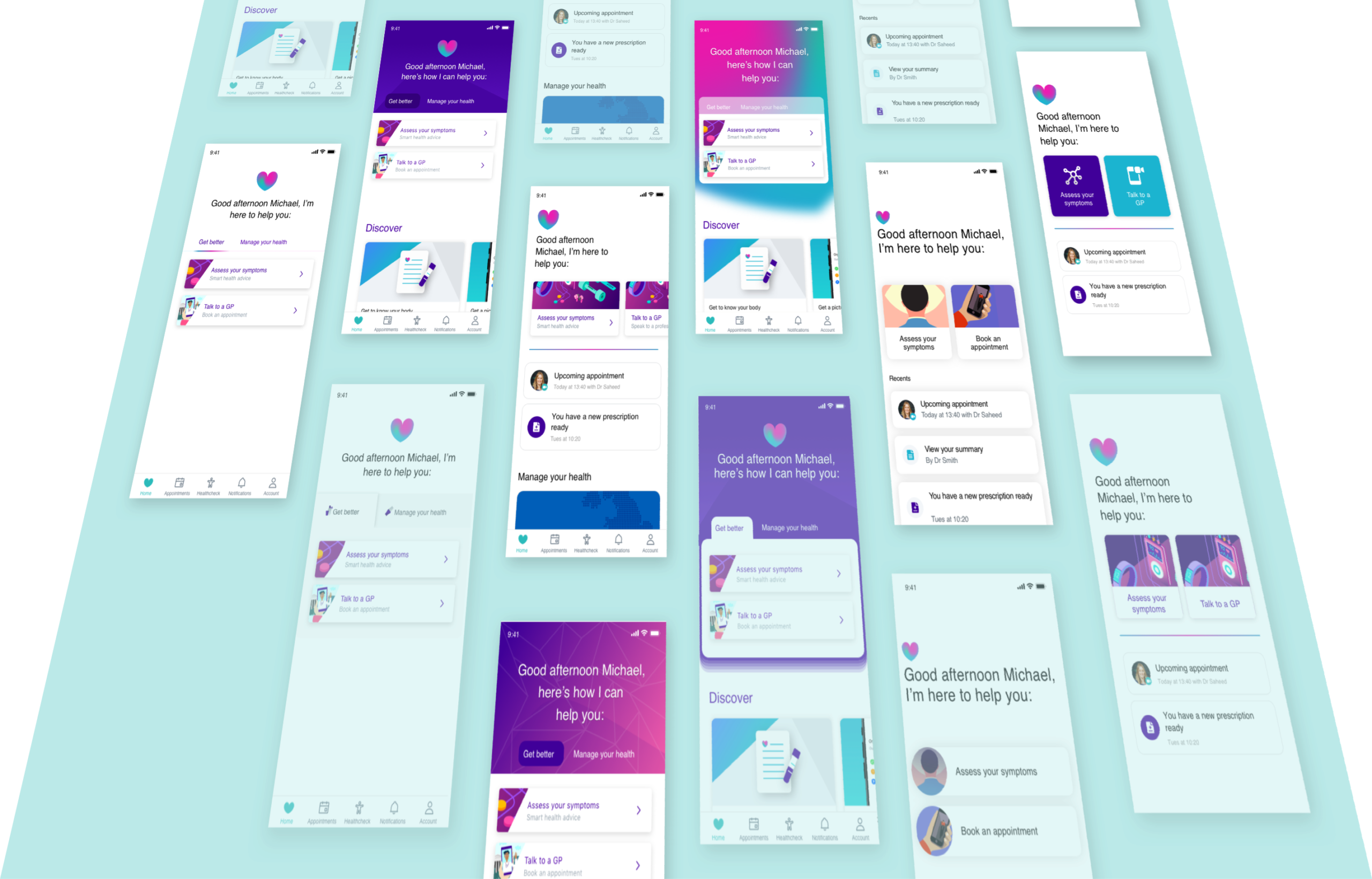
We began by exhaustively iterating potential solutions. These were critiqued and refined until we had a few early candidates to explore. These were then mocked up as low fidelity wireframes for further critique.

Initial design
In the spirit of divergence, we divided key work-streams and began with initial UI concepts. I focused on the home screen in particular whilst my colleague handled the ‘symptom selection’. As is such in many organisations, the ‘home screen’ is valuable real estate. This lead to a range of stakeholder workshops to ensure a balanced and effective solution.

Qualitative Research
We carried out some in house usability testing to ensure that the proposed solutions would allow users to seamlessly enter into the symptom checking experience. Through observing users carrying out tasks, we were able to gain valuable insights into key problem areas.
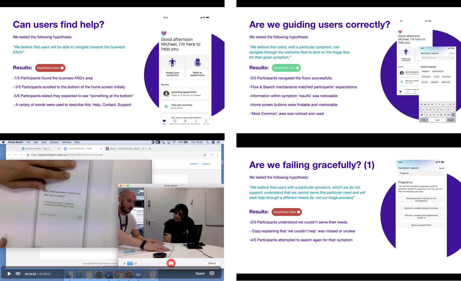
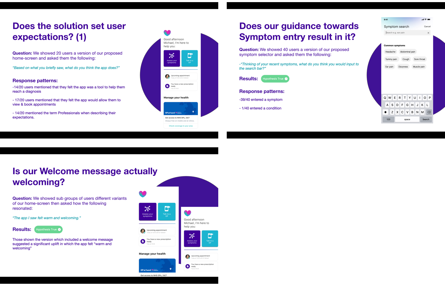
Quantitative Research
Alongside this. we harnessed a wider audience here to ensure that there was quantitative data behind the solution. We ran a survey with 40 users and asked them some questions around:
– How relevant is the “welcome message” – does it add to the experience?
– Do users understand the value proposition? What do they think they can do from this screen?
– What do they expect when clicking on the “check symptoms” button?
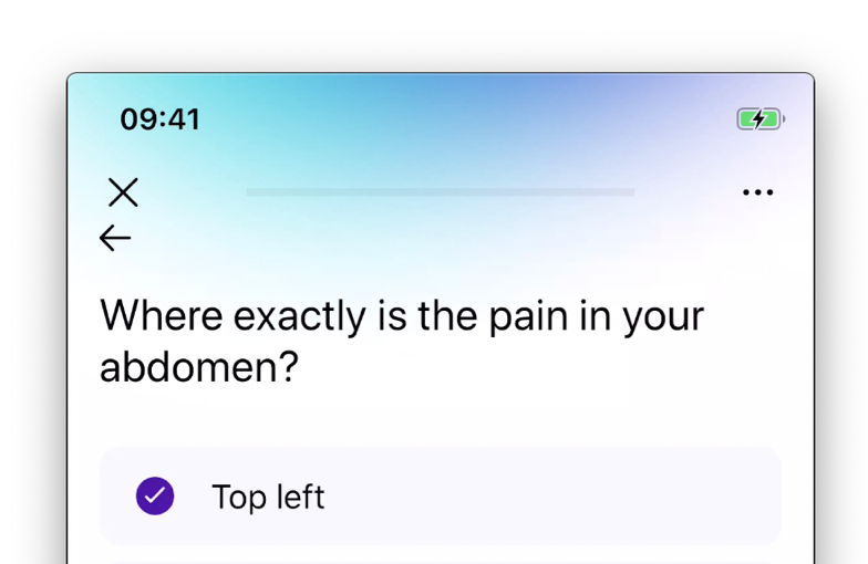
Architectural + UI basics
Finally, I spent time addressing the architectural and UI tweaks that had been missed previously.
Results
As part of the overall initiative, the work carried out was a large part of an 8% uplift in completion rate of the symptom checking flow.
Other Case Studies