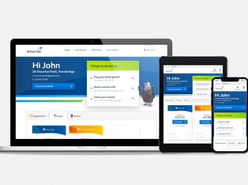
Account Dashboard Refresh
My Role: Discovery > Information Architecture > UX/UI Design > Validation
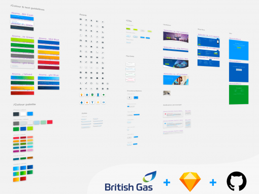
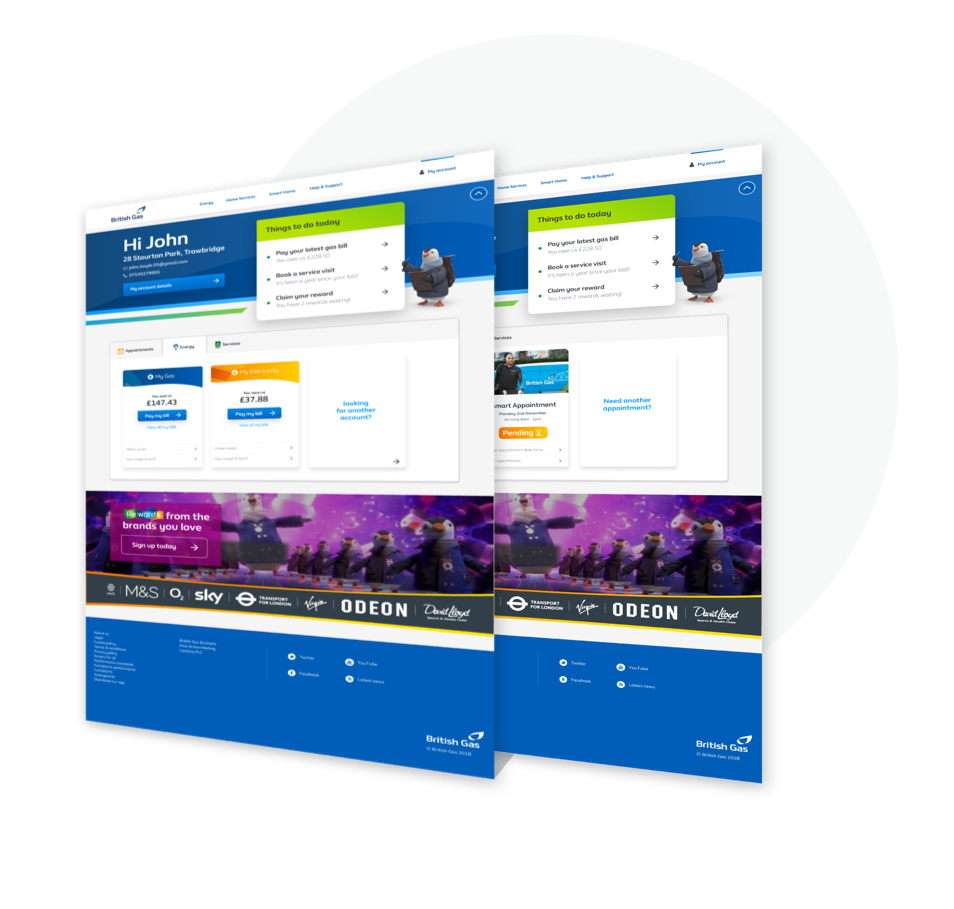
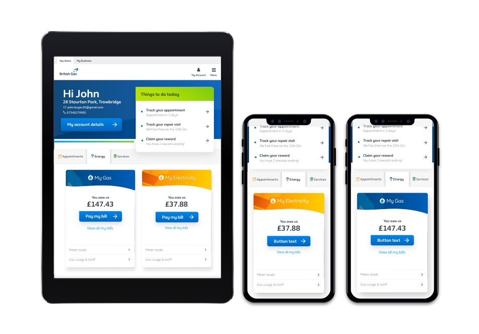
A large part of the Next-Generation Website involved a brand refresh of existing areas of the British Gas website. Being the highest visited page for logged in users (300k weekly visitors), the account dashboard was highlighted as one of the earlier pages to be explored.
Goal
Align the existing account dashboard with the proposed brand refresh principles
Discovery
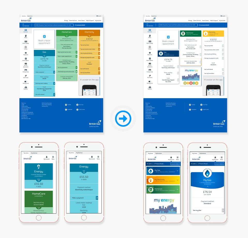
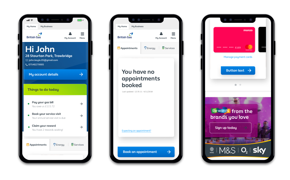
An initial usability testing session was carried out to understand if the account dashboard would accommodate new branding components in its existing state. Some minor visual tweaks were carried out to the current components in efforts to simplify the page overall. Along with testing dashboard related tasks, we also looked to understand the initial visual impact of this page. By carrying out a snap test along with a card sort, we were able to understand the impact in comparison to the proposed branding principles.
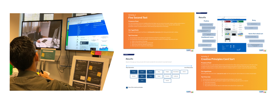
Initial testing findings
Whilst customers felt that the updated design felt in line with our branding principles, this didn’t carry through when task-based activities were carried out. The lack of information hierarchy and “busy” nature of the page led to struggles in finding relevant journeys. With additional functionality being requested of the page, its current structure also lacked the ability to accommodate further features in a usable manner.
Hypotheses
- Give customers relevant information at the right time for them
- Surface actions and allow people to access their tasks more easily
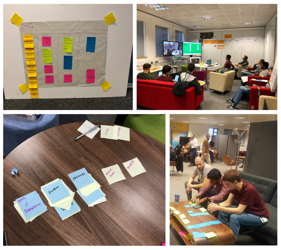
Card sorting exercise
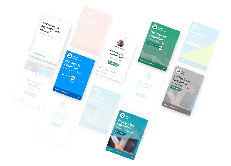
By breaking down the analytics related to the account dashboard, we were able to highlight all of the possible elements that could live on the page – along with their relative weekly visits. Plotting this in a visual manner exposed the need to group and remove elements from the page.
Being the starting point of a variety of journeys I undertook a task of understanding both customer and business expectations with regards to the information hierarchy of the page. By carrying out a card sort on all of the items on the page it was possible to understand elements that were expected to “live together” and those items that had no impact on customers at this stage of their interactions with the site.
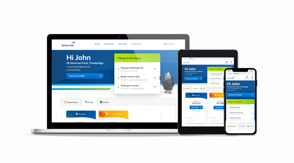
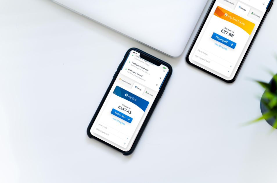
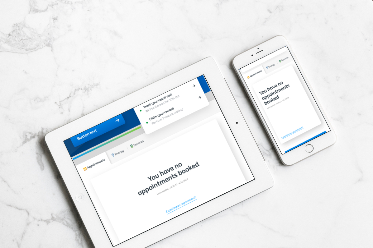
Concept designs
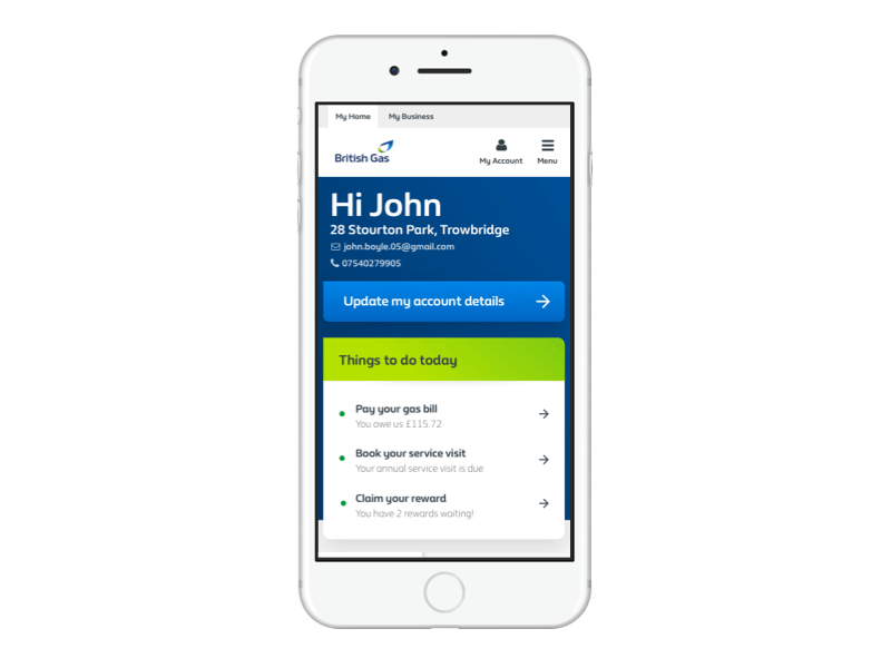
Following on from various findings, I carried out some concept designs in efforts to explore the proposed grouping and simplification of the page.
Other Case Studies