UI-Toolkit
Project Team: John Boyle, Pukar Bhattarai, Rob Bailey
My Role: Strategy > Implementation > Workshop Facilitation
Challenge
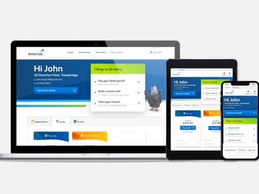
Since its initial creation, the British Gas website has seen the increase in the number of design inconsistencies across the site. When tracking these inconsistencies back a level it became clear that whilst there was a design style guide, it wasn’t easy to use and as such was being ignored by a number of product teams.
Approach:
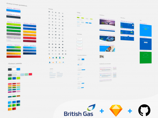
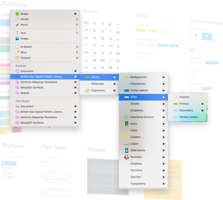
The first consideration made in this process was to ensure that the final solution would fit seamlessly into the tools already being used by designers. In our case, this was Sketch. Our next consideration was to look at componentizing the British Gas website.
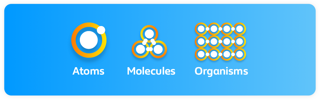
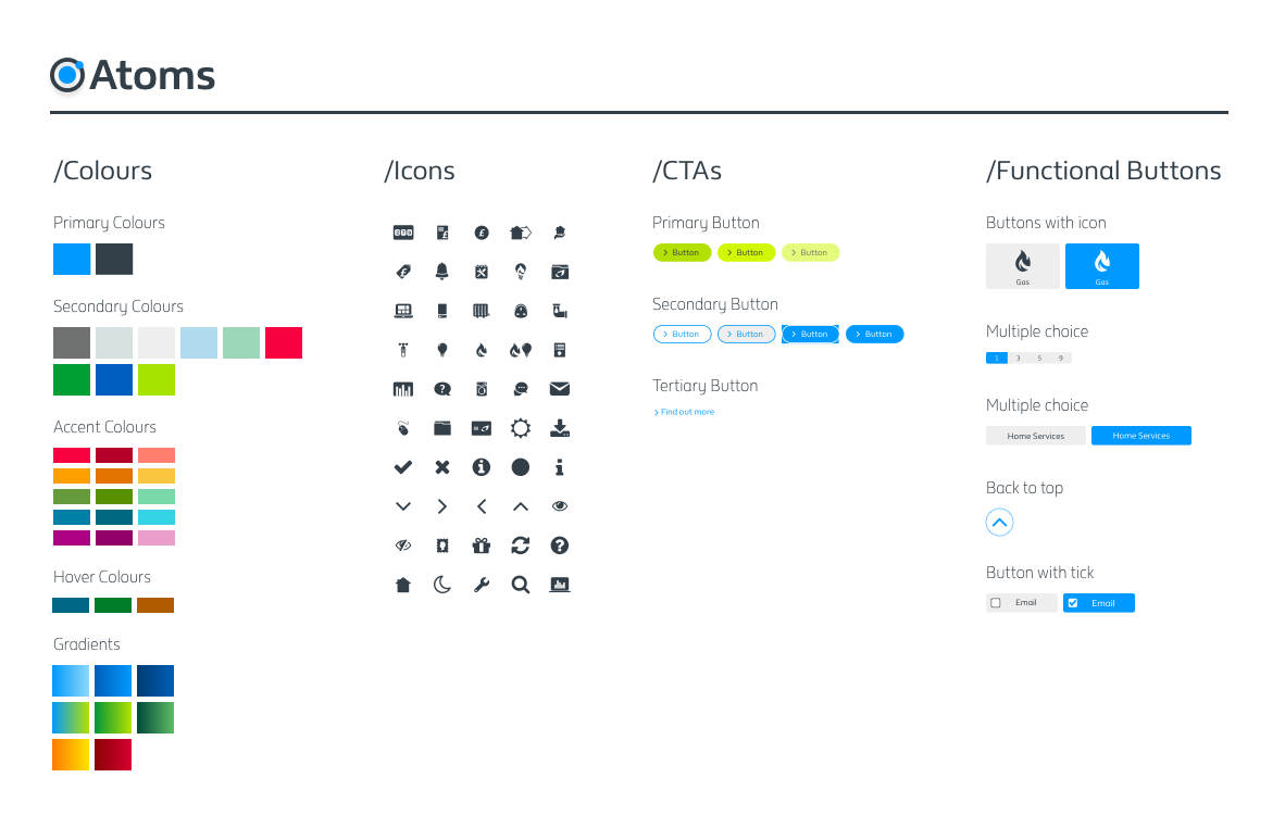
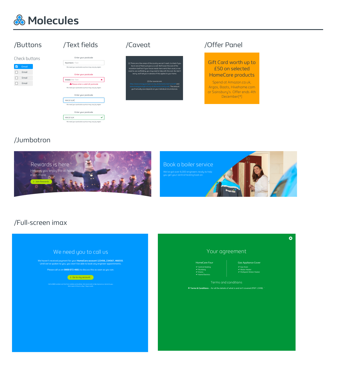
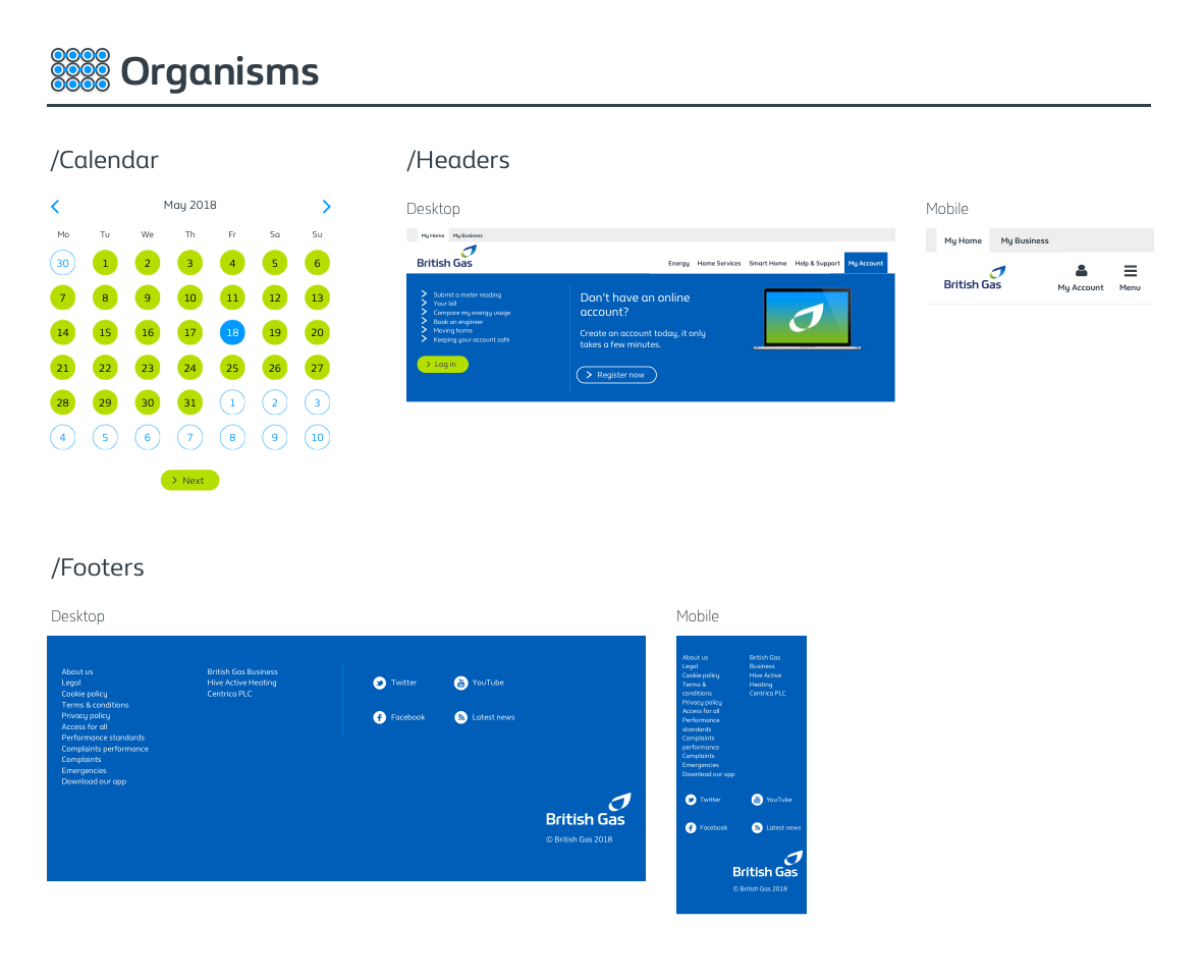
Fortunately, there had already been a large amount of work done to break strip the British Gas website into a number of components. This followed the Atomic Design principles as coined by Brad Frost. We were fortunate enough to receive a list of Atoms, Molecules, Organisms etc.!
Creating the components
Using the existing list of components, the team began creating symbols within sketch – these were to be eventually stored within a shared library. Integrating existing symbols into new components was key in enabling this to be viable from a time standpoint.
A usable Sketch library for all…
The end product from this phase was a shared sketch library that could be accessed by all of the designers working within British Gas. With over 50 designers in 4+ locations, the library itself would aim at reducing a great deal of wasted time and effort by putting all of the current components at their fingertips.
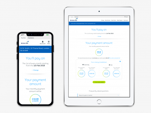
Scenario proofing
Whilst a list of components is incredibly useful, it still isn’t quite sustainable.
Designers won’t use libraries unless they are reusable in multiple scenarios.
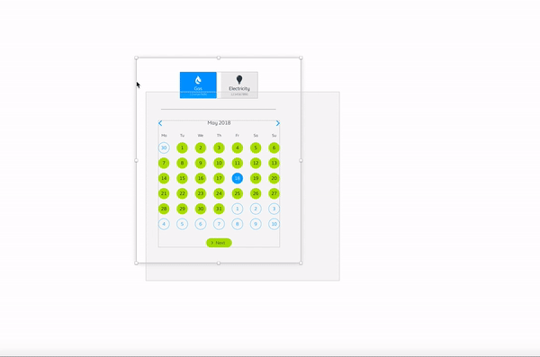
In order to combat this issue, we made sure to ‘scenario proof’ these components such that they would stretch and scale. We also made use of masking to allow components to be changed in colour – all within the BG colour palette..
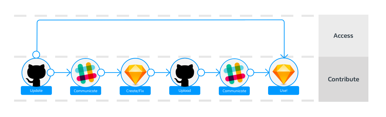
Processes and Improvements
In the spirit of collaboration, the aim was to provide other designers with the ability to contribute towards the growth of the toolkit. This, however, was optional and there was also a stream of designers who only had the time to make use of it.
Onboarding
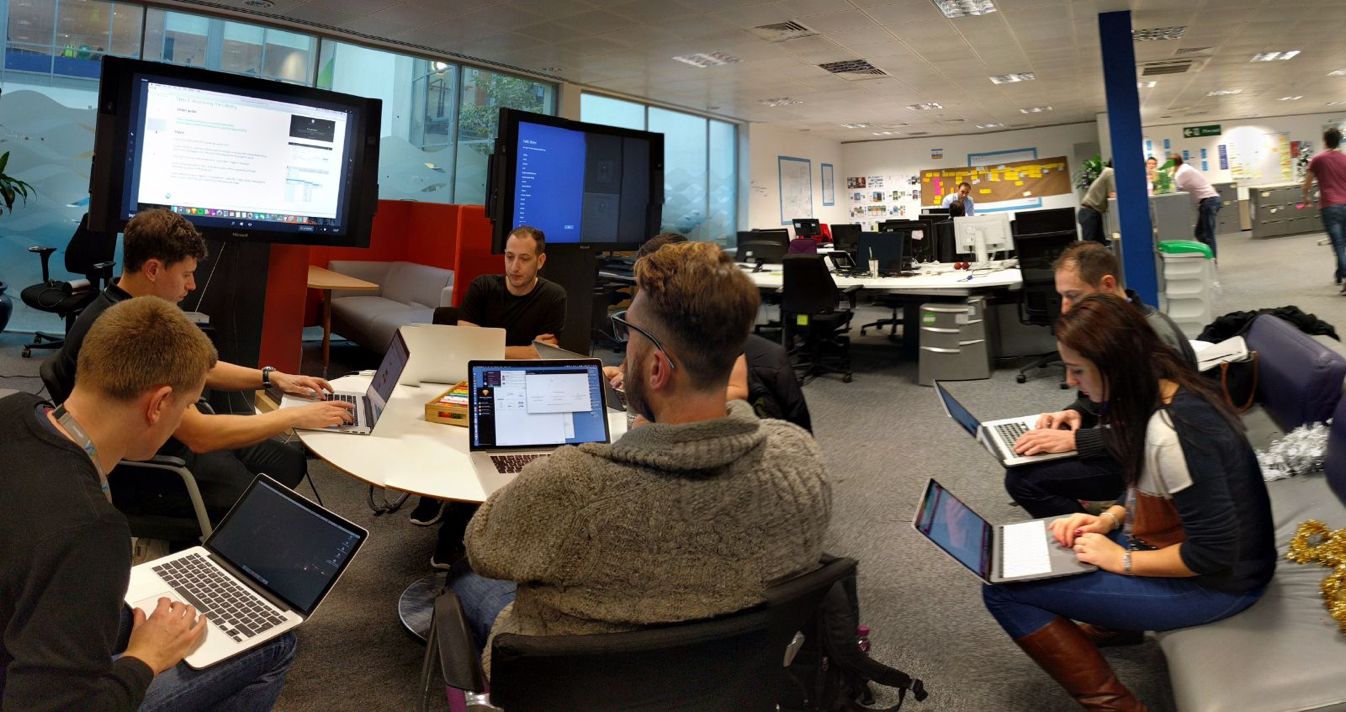
Finally, I carried out a large number of workshops with fellow designers, ensuring that everybody was comfortable using the UI toolkit. This proved as an incredibly easy way to gain feedback and improve the library itself, as well as the onboarding.
Other Case Studies